
Colour schemes in the home
Colours bring a pleasant atmosphere and energy to your interior. Even so, the shades matter, and so does personal taste, which differs from person to person. Colour schemes can follow various modern trends, but they still need to feel pleasant, and everyone should feel good in such rooms. So if you are not sure about grey, definitely avoid it! After all, you are the one who will be living in that interior.
Choosing colours
When furnishing an interior, stick to three dominant colours. Even these need to be chosen with care, and they should go well together. Colour schemes are usually based on the colour wheel, which offers a wide range of options. For example, you can choose colours opposite each other, combining a warm and a cool colour, or three colours next to each other: blue-green, green and green-yellow look really interesting.
In general, designers follow a simple 60-30-10 rule. This helps you create an ideal, pleasant colour palette for the space. The idea is that 60% of the room should be the dominant colour, 30% a secondary colour or texture (you can also choose wallpaper that looks luxurious), and 10% should be just an accent.
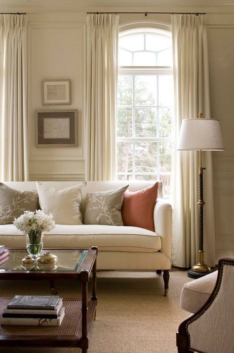
Monochrome interior
Different colour schemes also work well with a monochrome palette, where you choose just one colour and use lighter or darker variations of it throughout the space. This is popular with grey, cream, white or grey, for example. If you go for lighter shades of these colours, you will brighten the space. You will especially appreciate this in smaller flats or rooms that are short on space. Do not be afraid to use mirrored surfaces or ordinary mirrors in such rooms, as they make the space feel pleasantly larger.
In practice, the rule of three
As we have mentioned, the first number is 60%, so this is the main colour of the room. Ideally, it should be light, neutral or even pastel. Which parts of your interior should it be used for? Mainly walls, rugs, the sofa or large pieces of furniture.
The 30% rule refers to the proportion of the secondary colour in your space. It should support the main colour, but it should also be different enough to make the room interesting. These colours are best suited to curtains, decorative pieces of furniture or chairs.
Finally, the last number, 10%, works as follows. This can be a bolder or a softer colour, but either way it gives the room much-needed character. It covers items such as cushions, other textiles, fabrics and decorative accessories.
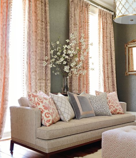
Do not be afraid to break the rules
If you have a feel for colour, then by all means mix things up and break the rules. Just remember that the interior should be well coordinated, not chaotic. You can add a fourth colour to this “holy trinity” to give the room the proverbial icing on the cake. Choose interesting wooden decorations or other home accessories. For example, grey is typical of industrial style, but why not add a bolder colour to it? Coloured tones give the room an unexpected dimension, and that is highly valued in any interior.
Leave a Reply